Perhaps you’re a new trader with a limited budget and are feeling overwhelmed by the price of shares issued by major companies. Or maybe you’re an experienced investor looking to purchase lots of shares with the potential for significant gains. Either way, penny stocks are worth learning about and incorporating into your portfolio. The affordability of these shares, though, doesn’t mean that you can get by without understanding the difference between good and bad trades. Just like any other type of investment, you need to learn how to evaluate data and follow penny stock trends to succeed in this market.
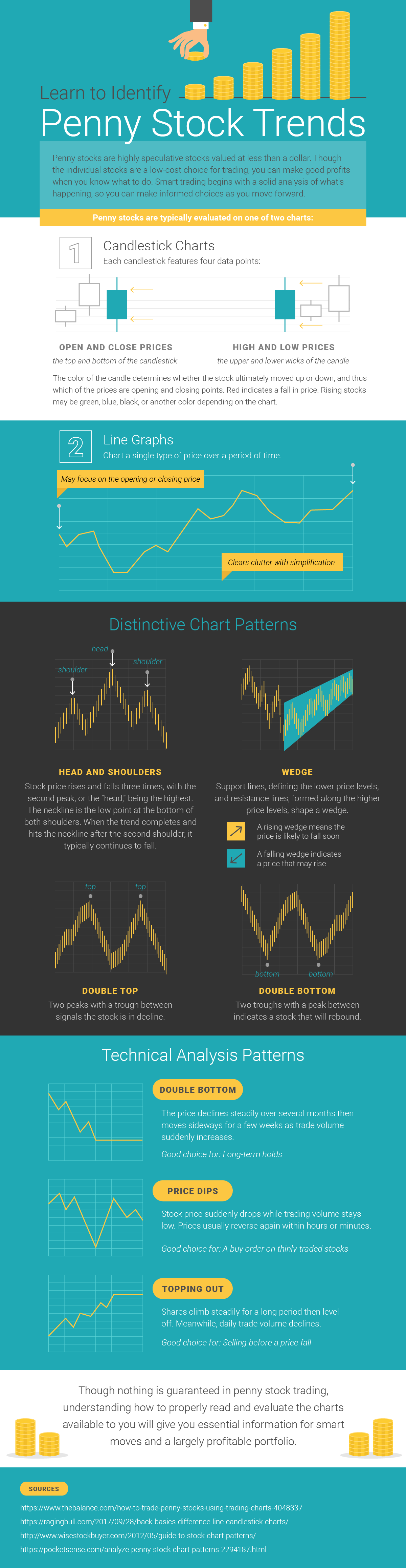
Penny stock trends are typically evaluated using either candlestick charts or line graphs. Candlestick charts are great for monitoring open and close prices as well as the high and low prices of a stock. Understanding a share’s highest and lowest value and where it’s started and ended can help you identify when a share has exceeded or dropped below its typical value — thus informing when you should buy or sell shares to get the most from your investment.
Line graphs are beneficial since they’re easier to read than candlestick charts. But their simplicity is also somewhat of a drawback; line graphs usually only document the opening and closing price of a certain stock. The readability and straightforward nature of this data make them a great complement to the more detailed and complex candlestick charts. More information about these types of graphs, the data they record, and how you should use this material to build your portfolio is shared in the following infographic.